Dating Site Reviewed by Experts, Episode Two

This is a new episode in our series of dating site reviews performed by PG Dating Pro’s Experts team.
This time, we talk about VictoriyaClub.com, an international dating website that has been around since 2011. Its main focus is to let men from the West meet girls from the East.
Watch this video to hear our comments about communication tools, seasonal decorations, and some design tweaks that would make this site even better, or keep reading for more details.
And we start with the design.
Design
The main site page is very active, colorful, and eventful. The biggest advantage is that it grabs your attention instantly and in many different ways. For example, the main slider shows off the options that the site owners want you to pay attention to. Here you see some advertising content, general info about the pricing, newly added options, and tips about the available support services.

A good solution has been to put up a short sign-up/sign-in form on the very first screen, which is the screen that you see right away without having to scroll the page. This helps to increase the conversion rate significantly because the users don’t spend time looking for the registration form and there’s less chance that they’ll leave the site.
Also, since boosting communication is the main site’s purpose, the owners took every step to prompt the conversation right away. For instance, the chat invitations are shown repeatedly and the main page contains a lot of user pictures, tempting you once again to join in.
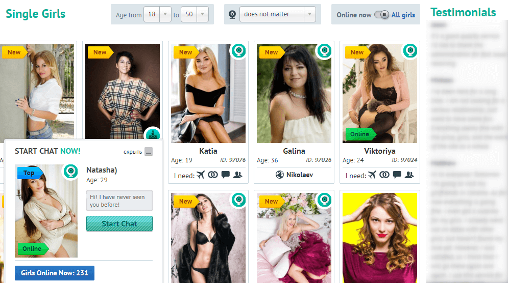
However, the quick change of images and various color palettes in the slider added up to the abundance of small elements on the page can create a so-called information noise effect. A site visitor can be quite baffled by all the information he or she perceives, and as a result, the conversion rate can dropdown.
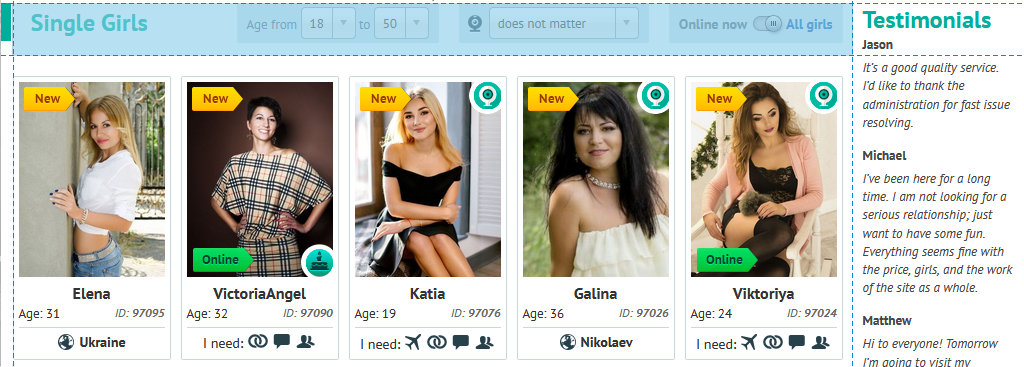
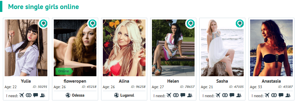
Design-wise, there’s a certain disregard of the proximity principle, which means closeness or distance of individual design elements. Proximity indicates a connection between elements, and here we see, for example, that photos are closer to testimonials than they are to the actual headline of the block, ‘Single Girls’ and the short search form above:
The same applies to the ‘Real Stories of Single Girls’ block above, where the content seems to be equally distanced from its own headline and the headline of the new content block below, so you can’t really tell the difference.
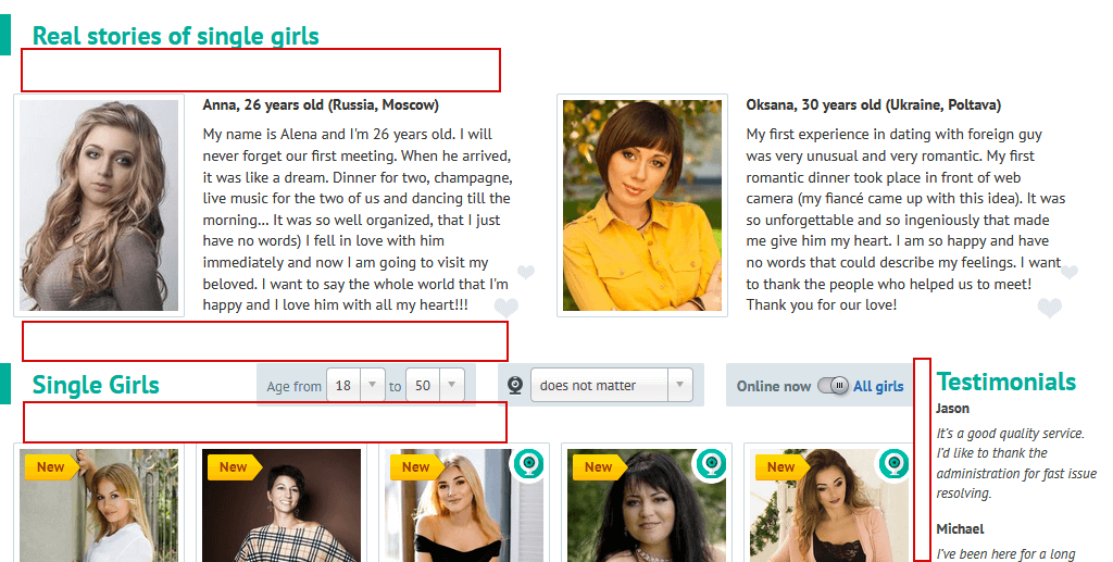
These are all seemingly small things, but they may blur the meaning of the elements and prevent the desired effect, leaving visitors dissatisfied with the visit.
What we can advise here is building a clearer correspondence between the blocks and their titles with the help of margins. It is possible to transfer the many information and activity icons and user IDs from the main page to the profile pages.
![]()
Increasing the page width and using more of the page space would also help structure the elements more clearly.
User profile
The first thing that draws your attention when you view a lady’s profile is the main picture, plus you can load the gallery of other photos without going away to another page. The user info is structured and easily comprehended, which is cool as you don’t need to scroll down for it.
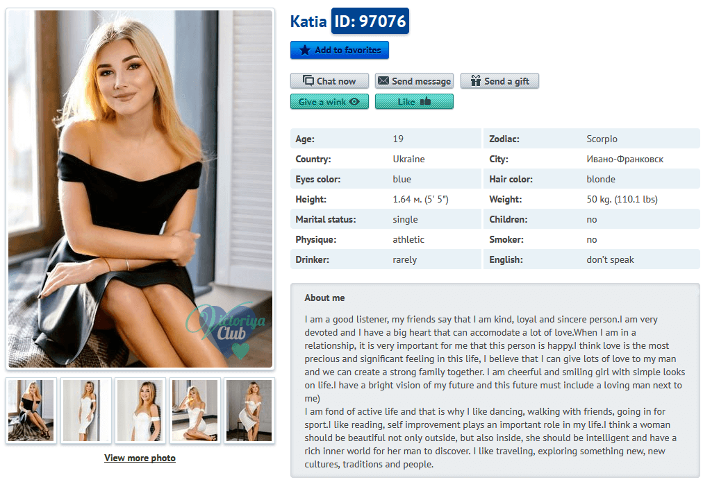
The system shows the date of the last activity and offers to view other profiles, which keeps you interested and involved.
So, the profile is built remarkably well, the only thing we would advise is revising the priority for the communication options, maybe choose one main option and hide the rest in the drop-down menu or at least remove the color-coding in order not to puzzle the visitors. Also, we’re not sure why so much attention is drawn to the user ID, but from our perspective, it overshadows the communication options making them seem less important.

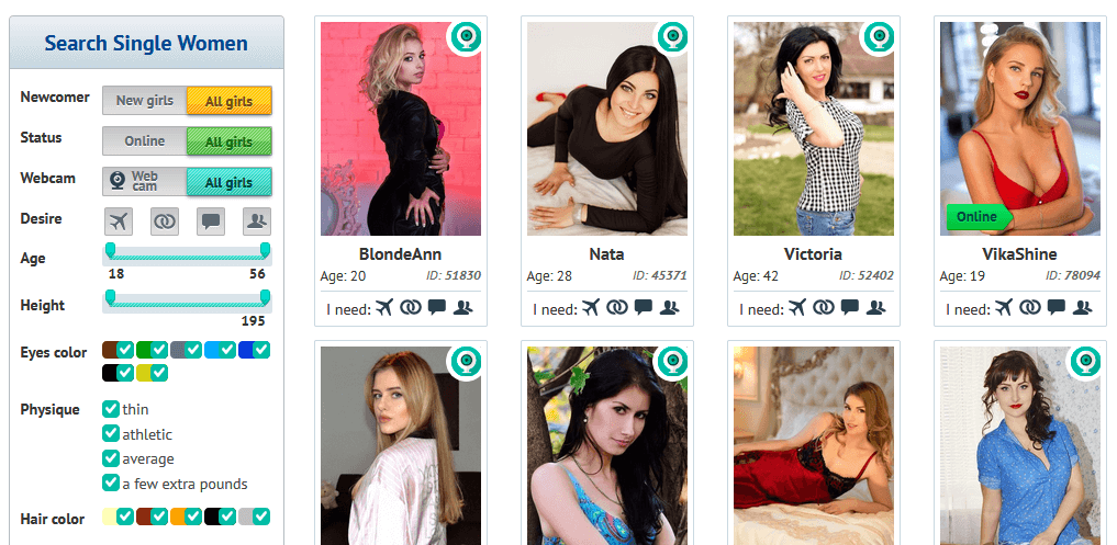
The search is well organized, it uses a lot of indicators and filters. However, the same notes apply here, it might create the color and information noise.
Search engine optimization
Our marketing specialists have performed the SEO audit check and we can say that a truly great job has been done to promote the website and draw traffic.
The audit results show that the site owners have made a lot of efforts to promote the site organically through the display adverts and the social networks and they also took care of adapting the site for the search robots by writing out keywords, descriptions, titles, etc. Both the titles and the semantic URLs are unique for each user and display info about them:
https://victoriyaclub.com/blondeann-ID-51830-20-years-old/
<title>ID 51830 - BlondeAnn from (Ukraine), 20 years old, blonde, blue eyes</title>
<meta name="keywords" content="BlondeAnn russian brides review Ukraine 20 years online dating VictoriyaClub.com">
<meta name="description" content="BlondeAnn, 20 years, blonde hair, blue eyes - VictoriyaClub.com. On the beginning of my biography i wanna say that i am cheerful, kind and very sympathetic. Also ,it depends on situations I'm curious, sometimes sentimental, sometimes strict, but always fair. The mo...">
The results speak for themselves, the site gets 40 to 50 thousand visitors every month. What is more, the bounce rate is really small, only around 23%. There are some small drawbacks, like excessive redirection which influences the load speed or the appearance of the deleted/inaccessible profile pages in search, but they’re not critical.
VictoriyaClub.com is an efficient website because the owners have been able to identify their target audience and promote the site successfully among them.


