5 Pop-Ups To Use On Your Site
Do pop-ups annoy you? I’m sure that you, as an internet user, angrily closed pop-ups that prevented you from checking out some interesting material, right?.
But site owners and marketers wouldn’t use them if they did not work. The trick is to use pop-ups properly. A global SumoMe study analyzed 2 billion pop-ups and calculated successful pop-ups conversion to be about 9.3%, some reach 50%, and the average conversion is 3%.
Pop-ups solve a lot of problems: they gather new leads, they segment users, they increase the registration and purchase conversions, they increase the average check (ARPU) and some other useful things.
Depending on its goal, the pop-up may appear at different stages of user interaction with the site. For example, some are displayed a few seconds after the first visit, others – when the user has added something to the shopping cart, and others – when they have already moved the mouse to leave the site.
In Dating Pro, we constantly use pop-ups. It’s time to share our experience, how to use pop-ups for different scenarios, how to lead the user to purchase and make them loyal.
All pop-up examples below were created on the Optimonk platform that we use ourselves.
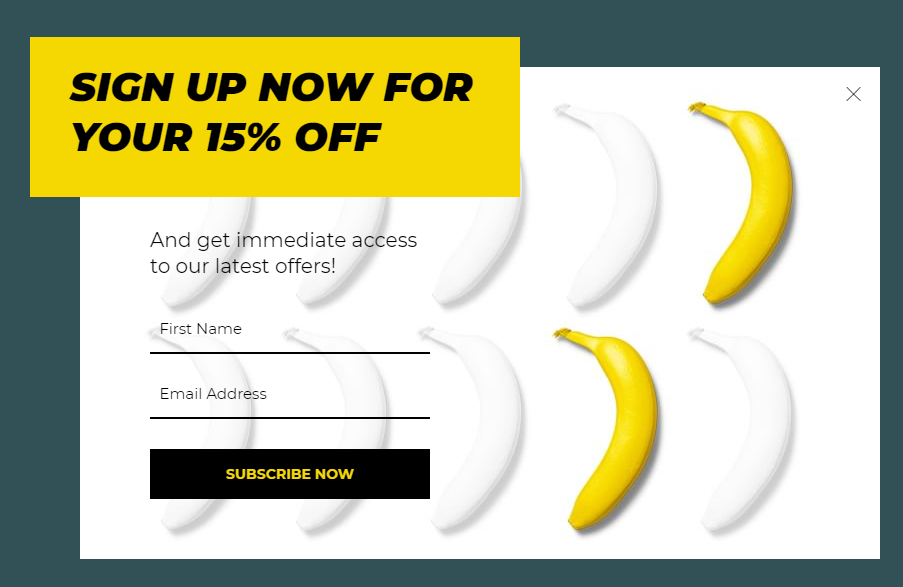
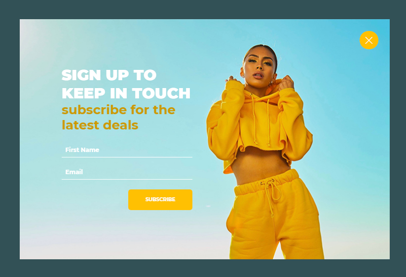
Type 1: configure lead generation
Our goal – collect as many lead contacts as possible. If a visitor leaves an email or phone number, then he is at least interested in you and your service. You can, later on, warm them up with e-mail, sms or social media sequence to help them understand why they’d benefit from using your service.
It is important to make the right impression, as there may not be a second chance.
To get a higher chance that the user leaves their email, you’ll need to motivate them somehow. A discount is a great motivation: you can offer to send a promo code to their personal email address.
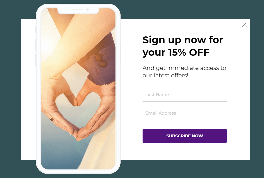
Type 2: push towards registration
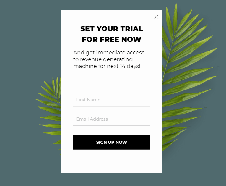
Goal – Remind the visitor that before they can start, they must register on your site. If you have a free trial, mention it!
Here is such a pop-up where we remind the users of the value and that they can test the service for 14 days for free:
 Type 3: increase user activation and engagement
On your own site, everything may seem simple and understandable. But in fact, users don’t always know about all available features or that they will soon receive/lose access to something.
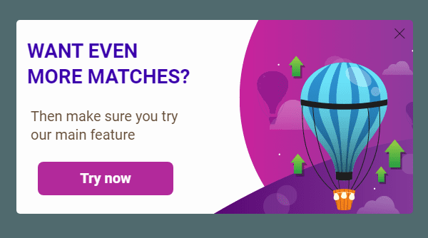
Small tips help your users not to forget that it’s time to recharge their accounts, and also explain the importance of some features.
With the help of such pop-ups, you can, for example, configure new users onboarding: a step-by-step introduction to your service and how to benefit from it. In addition, you can send transactional messages, set up navigation, announce updates and do much more other cool stuff.
Type 4: increase average check
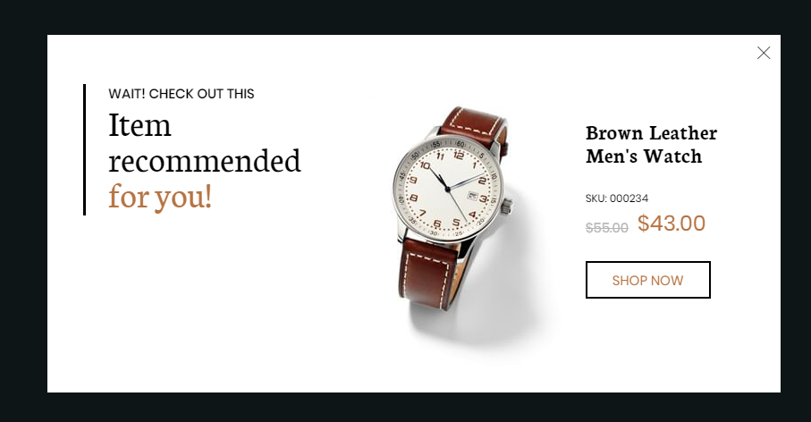
The average check or ARPU (average revenue per user) is used to monitor revenue. ARPU growth suggests that things are going well, so every marketer and entrepreneurs are committed to it. We’ve already discussed this KPI in one of our articles.
The average check can be increased with just one pop-up. Offer the user a bonus for a slight increase in his current order: most likely, he will not refuse.
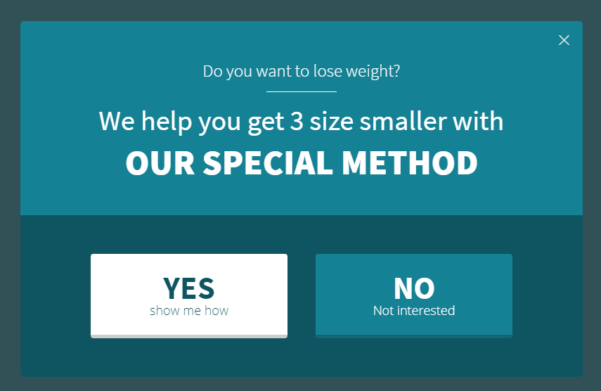
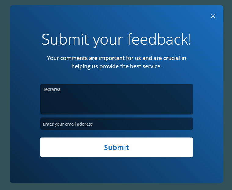
Type 5: collect feedback and create return path
Don’t forget to ask customers how they evaluate their experience with you. This will help you find growth points and get to know your audience better.
Try to respond to every message: customers will be pleased to be heard, and you will quickly understand what else you need to work on.

